Chapter 12 -- Visualising many responses -- Exercise solutions and Code Boxes
David Warton
2022-08-24
Chapter12Solutions.RmdExercise 12.1: Flower size and shape
How do these three species of Iris differ in terms of flower size and shape?
What sort of graph should Edgar produce to visualise how species differ in flower size and shape?
He has more than two response variables so I guess as well as plotting each response one-at-a-time he could try plotting them simultaneously using ordination (factor analysis, for example). In either plot he would want to label different species differently to see variation across species.
Exercise 12.2: Bush regeneration and invertebrate counts
Is there evidence of a change in invertebrate communities due to bush regeneration efforts?
What sort of graph should Anthony produce to visualise the effects of bush regeneration on invertebrate communities?
Anthony has a bunch of response variables so I guess as well as plotting each response one-at-a-time he could try plotting them simultaneously using ordination. He has counts so will need something that works for non-Gaussian responses like generalised latent variable models. In either plot he would want to label different species differently to see variation between revegetated and control plots.
Code Box 12.1: Plotting the bush regeneration data of Exercise 12.1 using mvabund.
library(mvabund)
library(ecostats)
data(reveg)
reveg$abundMV=mvabund(reveg$abund) #to treat data as multivariate
plot(abundMV~treatment, data=reveg)
#> Overlapping points were shifted along the y-axis to make them visible.
#>
#>  PIPING TO 2nd MVFACTOR
#> Only the variables Collembola, Acarina, Formicidae, Coleoptera, Diptera, Amphipoda, Isopoda, Larvae, Hemiptera, Soleolifera, Hymenoptera, Araneae were included in the plot
#> (the variables with highest total abundance).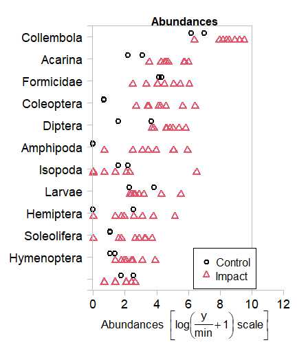
plot of chunk code12.1
Can you see any taxa that seem to be associated with bush regeneration?
There seem to be less invertebrates in control plots for Collembola, Acarina, Coloeptera, Amphipoda and maybe a few Orders.
Code Box 12.2: A PCA of Edgar’s Iris data
data("iris")
pc = princomp(iris[,1:4],cor=TRUE)
pc
#> Call:
#> princomp(x = iris[, 1:4], cor = TRUE)
#>
#> Standard deviations:
#>    Comp.1    Comp.2    Comp.3    Comp.4
#> 1.7083611 0.9560494 0.3830886 0.1439265
#>
#>  4  variables and  150 observations.
loadings(pc)
#>
#> Loadings:
#>              Comp.1 Comp.2 Comp.3 Comp.4
#> Sepal.Length  0.521  0.377  0.720  0.261
#> Sepal.Width  -0.269  0.923 -0.244 -0.124
#> Petal.Length  0.580        -0.142 -0.801
#> Petal.Width   0.565        -0.634  0.524
#>
#>                Comp.1 Comp.2 Comp.3 Comp.4
#> SS loadings      1.00   1.00   1.00   1.00
#> Proportion Var   0.25   0.25   0.25   0.25
#> Cumulative Var   0.25   0.50   0.75   1.00
biplot( pc, xlabs=rep("\u00B0",dim(iris)[1]) )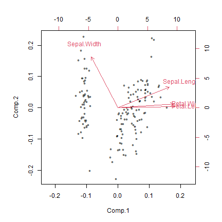
plot of chunk code12.2
Code Box 12.3: Factor analysis of the Iris data
library(psych)
fa_iris <- fa(iris[,1:4], nfactors=2, fm="ml", rotate="varimax")
loadings(fa_iris)
#>
#> Loadings:
#>              ML1    ML2
#> Sepal.Length  0.997
#> Sepal.Width  -0.115 -0.665
#> Petal.Length  0.871  0.486
#> Petal.Width   0.818  0.514
#>
#>                  ML1   ML2
#> SS loadings    2.436 0.942
#> Proportion Var 0.609 0.236
#> Cumulative Var 0.609 0.844
How do results compare to the principal components analysis?
They look awfully similar. The second factor looks a little different, and is flipped around the other way (so big vlues mean narrow sepals), but it also has postive loadings for petal variables. So this could be interpreted as a measure of how large petals are relative to sepal width: big scores for large petals with narrow sepals, low scores for small petals with wide sepals. Recall that previously, the second PC was pretty much just a measure of how wide sepals were, now it is relative to petal size.
Code Box 12.4: Assumption checking for a factor analysis of the Iris data
par(mfrow=c(2,2),mar=c(3,3,2,1),mgp=c(1.75,0.75,0))
for(iVar in 1:4)
{
  irisIvar = iris[,iVar]
  plotenvelope(lm(irisIvar~fa_iris$scores), which=1, col=iris$Species, main=print(names(iris)[iVar]), n.sim=99)
}
#> [1] "Sepal.Length"
#> [1] "Sepal.Width"
#> [1] "Petal.Length"
#> [1] "Petal.Width"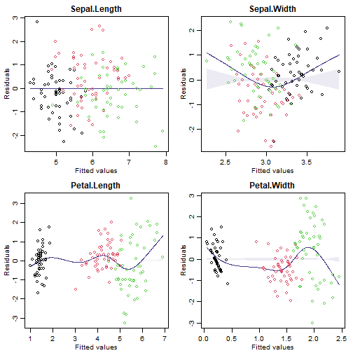
plot of chunk code12.4
plot(iris[,1:4],col=iris$Species)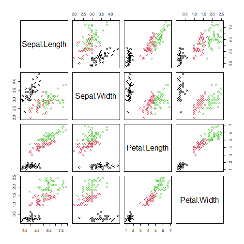
plot of chunk code12.4matrix
(Note that plotenvelope was run with just 59 iterations, to speed up computation time.)
Exercise 12.4: A factor analysis for Anthony’s data(?)
Load Anthony’s revegetation data (stored as reveg in the ecostats package) and do a factor analysis (with two factors).
data(reveg)
library(psych)
fa_reveg <- try(fa(reveg$abund, nfactors=2, fm="ml", rotate="varimax"))
#> Warning in cor.smooth(R): Matrix was not positive definite, smoothing was done
#> In smc, smcs < 0 were set to .0
#> Warning in cor.smooth(R): Matrix was not positive definite, smoothing was done
#> In smc, smcs < 0 were set to .0
#> Warning in log(e): NaNs produced
#> Error in optim(start, FAfn, FAgr, method = "L-BFGS-B", lower = 0.005,  :
#>   L-BFGS-B needs finite values of 'fn'
You might not be able to get a solution when using maximum likelihood estimation (fm=“ml”), in which case, try fitting using without specifying the fm argument (which tries to minimise residuals).
fa_reveg <- fa(reveg$abund, nfactors=2)
#> Warning in cor.smooth(R): Matrix was not positive definite, smoothing was done
#> In smc, smcs < 0 were set to .0
#> Warning in cor.smooth(R): Matrix was not positive definite, smoothing was done
#> In smc, smcs < 0 were set to .0
#> Warning in cor.smooth(R): Matrix was not positive definite, smoothing was done
#> In smc, smcs < 0 were set to .0
#> Loading required namespace: GPArotation
#> Warning in cor.smooth(r): Matrix was not positive definite, smoothing was done
#> Warning in fa.stats(r = r, f = f, phi = phi, n.obs = n.obs, np.obs = np.obs, : The estimated
#> weights for the factor scores are probably incorrect. Try a different factor score estimation
#> method.
#> In factor.scores, the correlation matrix is singular, an approximation is used
#> Warning in cor.smooth(r): Matrix was not positive definite, smoothing was done
This returned some concerning warnings but did fit the model :)
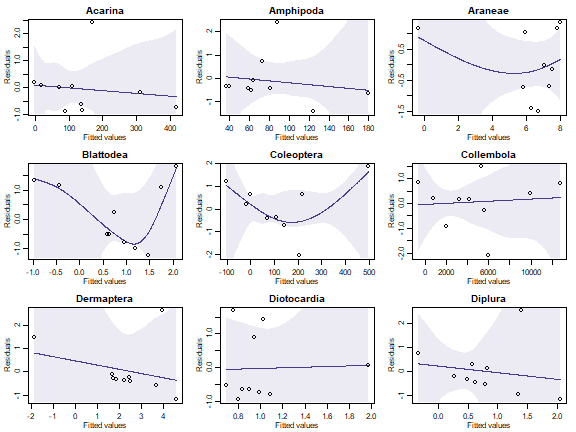
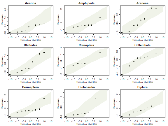
Check some assumptions, by fitting a linear model to some of the response variables, as a function of factor scores.
par(mfrow=c(3,3),mar=c(3,3,2,1),mgp=c(1.75,0.75,0))
for(iVar in 1:9)
{
  y=reveg$abund[,iVar]
  plotenvelope(lm(y~fa_reveg$scores), which=1,main=names(reveg$abund)[iVar], n.sim=99)
}
plot of chunk ex12.4RFplots
par(mfrow=c(3,3),mar=c(3,3,2,1),mgp=c(1.75,0.75,0))
for(iVar in 1:9)
{
  y=reveg$abund[,iVar]
  plotenvelope(lm(y~fa_reveg$scores), which=2,main=names(reveg$abund)[iVar], n.sim=99)
}
plot of chunk ex12.4QQplots
Can you see any issues with factor analysis assumptions?
With only ten observations it is always hard to see issues, and residual plots have huge error bars on them! But we have points outside their normal quantile simulation envelopes in several of these plots, and most have a suggestion of right-skew (the occasional large value). Note also that fitted values go below zero for many species which is most concerning considering we are modelling counts!
Code Box 12.5: Choosing the number of factors for the iris data
plot(fa_iris$values,type="l")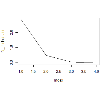
plot of chunk code12.5scree
nFactors=3 # to compare models with up to 3 factors
BICs = rep(NA,nFactors) # define the vector that BIC values go in
names(BICs) = 1:nFactors # name its values according to #factors
for(iFactors in 1:nFactors) {
  fa_iris <- fa(iris[,1:4], nfactors=iFactors, fm="ml", rotate="varimax")
  BICs[iFactors] = fa_iris$objective - log(fa_iris$nh) * fa_iris$dof
}
BICs
#>         1         2         3
#> -9.436629  5.171006 15.031906
How many factors are supported by the data?
One, this has the smallest BIC.
Code Box 12.6: A generalised latent variable model for Anthony’s revegetation data
data(reveg)
library(gllvm)
#>
#> Attaching package: 'gllvm'
#> The following objects are masked from 'package:VGAM':
#>
#>     AICc, nobs, predict, vcov
#> The following objects are masked from 'package:stats4':
#>
#>     nobs, vcov
#> The following object is masked from 'package:vegan':
#>
#>     ordiplot
#> The following object is masked from 'package:mvabund':
#>
#>     coefplot
#> The following objects are masked from 'package:stats':
#>
#>     nobs, predict, simulate, vcov
reveg_LVM = gllvm(reveg$abund, num.lv=2, family="negative.binomial", trace=TRUE, jitter.var=0.2)
logLik(reveg_LVM)
#> 'log Lik.' -675.5768 (df=95)
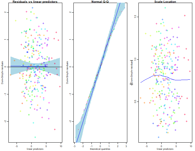
Repeating this several times usually returns an answer of -689.3, so we can be confident this is (close to) the maximum likelihood solution. To get a biplot of this solution:
ordiplot(reveg_LVM, col=as.numeric(reveg$treatment), biplot=TRUE,
ind.spp=12)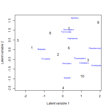
plot of chunk code12.6bi
plot of chunk code12.6plot
Exercise 12.5: Checking analysis decisions for Anthony’s revegetation data
In Code Box 12.6, a negative binomial model was fitted, using two latent variables. Are two latent variables needed, or should we use more, or less? Fit a few models varying the number of latent variables. Which model fits the data best, according to BIC?
reveg_LVM1 = gllvm(reveg$abund, num.lv=1, family="negative.binomial", trace=TRUE, jitter.var=0.2)
reveg_LVM2 = gllvm(reveg$abund, num.lv=2, family="negative.binomial", trace=TRUE, jitter.var=0.2)
reveg_LVM3 = gllvm(reveg$abund, num.lv=3, family="negative.binomial", trace=TRUE, jitter.var=0.2)
reveg_LVM4 = gllvm(reveg$abund, num.lv=4, family="negative.binomial", trace=TRUE, jitter.var=0.2)
reveg_LVM5 = gllvm(reveg$abund, num.lv=5, family="negative.binomial", trace=TRUE, jitter.var=0.2)
BIC(reveg_LVM1,reveg_LVM2,reveg_LVM3,reveg_LVM4,reveg_LVM5)
#>             df      BIC
#> reveg_LVM1  72 1557.821
#> reveg_LVM2  95 1578.730
#> reveg_LVM3 117 1575.276
#> reveg_LVM4 138 1587.444
#> reveg_LVM5 158 1633.496
For me two latent variable models was the winner!
Fit a Poisson model to the data and check assumptions. Are there any signs of overdispersion?
I’ll go with two latent variable models, on account of this looking the best in the above.
reveg_LVM1 = gllvm(reveg$abund, num.lv=2, family="poisson", trace=TRUE, jitter.var=0.2)
par(mfrow=c(1,3))
plot(reveg_LVM1,which=c(1,2,5))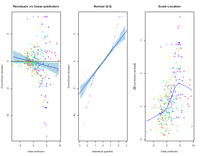
plot of chunk ex12.5
Wow this does not look good! There is a clear fan-shape in the residual vs fits plot, which also shows up as an increasing trend in the scale-location plot. Points on the normal quantile plot are well outside bounds on both sides, frequently falling below -5 or above 5 (when we would expect most values between -3 and 3). These are all strong signs of overdispersion.
Code Box 12.7: A non-metric multi-dimensional scaling ordination of Anthony’s data
library(vegan)
ord_mds=metaMDS(reveg$abund)
#> Square root transformation
#> Wisconsin double standardization
#> Run 0 stress 0.1611237
#> Run 1 stress 0.1687788
#> Run 2 stress 0.2684195
#> Run 3 stress 0.1611236
#> ... New best solution
#> ... Procrustes: rmse 0.0004585684  max resid 0.0008197316
#> ... Similar to previous best
#> Run 4 stress 0.2062042
#> Run 5 stress 0.3314815
#> Run 6 stress 0.1611239
#> ... Procrustes: rmse 0.0005366897  max resid 0.0009748253
#> ... Similar to previous best
#> Run 7 stress 0.1680773
#> Run 8 stress 0.1680773
#> Run 9 stress 0.1641165
#> Run 10 stress 0.2022877
#> Run 11 stress 0.1641165
#> Run 12 stress 0.1680773
#> Run 13 stress 0.1680773
#> Run 14 stress 0.1687788
#> Run 15 stress 0.1611236
#> ... Procrustes: rmse 0.0001032944  max resid 0.0001868105
#> ... Similar to previous best
#> Run 16 stress 0.1880315
#> Run 17 stress 0.1880316
#> Run 18 stress 0.1611238
#> ... Procrustes: rmse 0.0006247713  max resid 0.001114103
#> ... Similar to previous best
#> Run 19 stress 0.1880315
#> Run 20 stress 0.1611236
#> ... New best solution
#> ... Procrustes: rmse 0.0002105525  max resid 0.0003734638
#> ... Similar to previous best
#> *** Solution reached
plot(ord_mds$points,pch=as.numeric(reveg$treatment),col=reveg$treatment)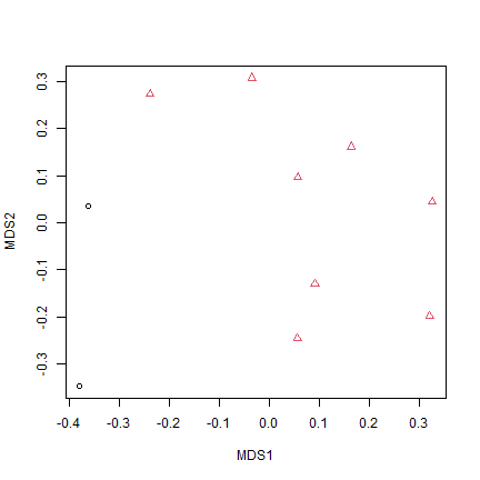
plot of chunk code12.7
Exercise 12.6: MDS ordinations of coral data
library(mvabund)
data(tikus)
tikusAbund = tikus$abund[1:20,] # for 1981 and 1983 data only
tikusAbund = tikusAbund[,apply(tikusAbund,2,sum)>0] # remove zerotons
Construct an MDS plot of the data, using the Bray-Curtis distance (default), and colour-code symbols by year of sampling.
tikus_mds=metaMDS(tikusAbund)
#> Square root transformation
#> Wisconsin double standardization
#> Run 0 stress 0.09863027
#> Run 1 stress 0.1096412
#> Run 2 stress 0.1144806
#> Run 3 stress 0.111816
#> Run 4 stress 0.09970471
#> Run 5 stress 0.1479043
#> Run 6 stress 0.1275178
#> Run 7 stress 0.1093704
#> Run 8 stress 0.09954172
#> Run 9 stress 0.1158263
#> Run 10 stress 0.1165909
#> Run 11 stress 0.10266
#> Run 12 stress 0.1054471
#> Run 13 stress 0.09954171
#> Run 14 stress 0.09954136
#> Run 15 stress 0.1010792
#> Run 16 stress 0.09863103
#> ... Procrustes: rmse 0.000412243  max resid 0.0009883379
#> ... Similar to previous best
#> Run 17 stress 0.1078694
#> Run 18 stress 0.09863022
#> ... New best solution
#> ... Procrustes: rmse 0.002205194  max resid 0.005495785
#> ... Similar to previous best
#> Run 19 stress 0.1078696
#> Run 20 stress 0.1475714
#> *** Solution reached
plot(tikus_mds$points,pch=as.numeric(tikus$x$time),col=tikus$x$time)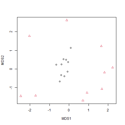
plot of chunk ex12.6ordination
Does this plot agree with the Warwick et al. (1990) interpretation? [Warwick et al. (1990) used this dataset and MDS ordinations to argue that stress increases dispersion in coral communities]
Yes it does, 1981 (before El Niño disturbance) the points are close together in the middle of the ordination, 1983 (post disturbance) they are spread out around the same point but way further apart, suggesting a change in dispersion.
Construct another MDS plot using the Euclidean distance on log(y+1)-transformed data.
tikus_mdsEuc=metaMDS(log(tikusAbund+1),distance="euclidean")
#> Run 0 stress 0.05741195
#> Run 1 stress 0.0574117
#> ... New best solution
#> ... Procrustes: rmse 0.0006040334  max resid 0.001755331
#> ... Similar to previous best
#> Run 2 stress 0.05741207
#> ... Procrustes: rmse 0.0002360083  max resid 0.0007165394
#> ... Similar to previous best
#> Run 3 stress 0.0574119
#> ... Procrustes: rmse 0.0005762837  max resid 0.001677264
#> ... Similar to previous best
#> Run 4 stress 0.07425327
#> Run 5 stress 0.05741188
#> ... Procrustes: rmse 0.0005713984  max resid 0.00166317
#> ... Similar to previous best
#> Run 6 stress 0.05741211
#> ... Procrustes: rmse 0.0002562405  max resid 0.0007773331
#> ... Similar to previous best
#> Run 7 stress 0.05741165
#> ... New best solution
#> ... Procrustes: rmse 7.397262e-05  max resid 0.0002236007
#> ... Similar to previous best
#> Run 8 stress 0.05741203
#> ... Procrustes: rmse 0.000571415  max resid 0.001643115
#> ... Similar to previous best
#> Run 9 stress 0.07425304
#> Run 10 stress 0.05741166
#> ... Procrustes: rmse 4.266406e-05  max resid 0.000132459
#> ... Similar to previous best
#> Run 11 stress 0.07425298
#> Run 12 stress 0.05741199
#> ... Procrustes: rmse 0.0005544893  max resid 0.001591259
#> ... Similar to previous best
#> Run 13 stress 0.05741213
#> ... Procrustes: rmse 0.0003408697  max resid 0.001033423
#> ... Similar to previous best
#> Run 14 stress 0.05741181
#> ... Procrustes: rmse 0.0001640364  max resid 0.0004996793
#> ... Similar to previous best
#> Run 15 stress 0.05741166
#> ... Procrustes: rmse 0.0003297201  max resid 0.0009738707
#> ... Similar to previous best
#> Run 16 stress 0.05741166
#> ... Procrustes: rmse 3.541119e-05  max resid 0.0001048059
#> ... Similar to previous best
#> Run 17 stress 0.05741194
#> ... Procrustes: rmse 0.0005278599  max resid 0.001523223
#> ... Similar to previous best
#> Run 18 stress 0.05741206
#> ... Procrustes: rmse 0.0005868747  max resid 0.00168278
#> ... Similar to previous best
#> Run 19 stress 0.07425299
#> Run 20 stress 0.05741184
#> ... Procrustes: rmse 0.0001881958  max resid 0.0005719071
#> ... Similar to previous best
#> *** Solution reached
plot(tikus_mdsEuc$points,pch=as.numeric(tikus$x$time),col=tikus$x$time)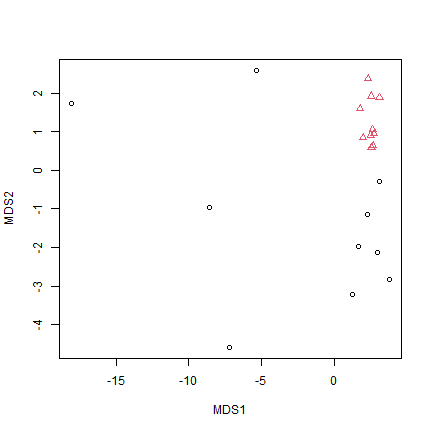
plot of chunk ex12.6EucOrdination
Does this plot agree with the Warwick et al. (1990) interpretation?
Nope – this says the opposite, with much lower dispersion post disturbance. It is suggestive of a location effect as well, that is, a change in mean abundance not just variability.
Use the plot.mvabund function to plot each coral response variable as a function of time. What is the main pattern that you see?
tikusMV = mvabund(tikusAbund)
plot(tikusMV~tikus$x$time[1:20])
#> Overlapping points were shifted along the y-axis to make them visible.
#>
#>  PIPING TO 2nd MVFACTOR
#> Only the variables Heliopora.coerulea, Montipora.digitata, Favites.abdita, Favites.chinensis, Platygyra.daedalea, Montipora.foliosa, Pocillopora.damicornis, Acropora.cytherea, Acropora.hyacinthus, Acropora.formosa, Pocillopora.verrucosa, Acropora.pulchra were included in the plot
#> (the variables with highest total abundance).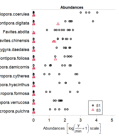
plot of chunk ex12.6plot
Convert the data into presence-absence and use the gllvm package to construct an ordination
tikusPA = tikusAbund
tikusPA[tikusPA>1]=1
tikus_LVM = gllvm(tikusPA, num.lv=2, family="binomial", trace=TRUE, jitter.var=0.2)
ordiplot.gllvm(tikus_LVM, s.col=as.numeric(tikus$x$time), biplot=TRUE, ind.spp=12)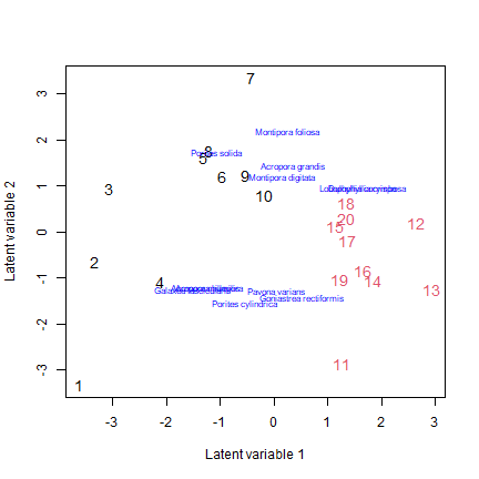
plot of chunk ex12.6PA
Do assumptions appear reasonable? How would you interpret this plot?
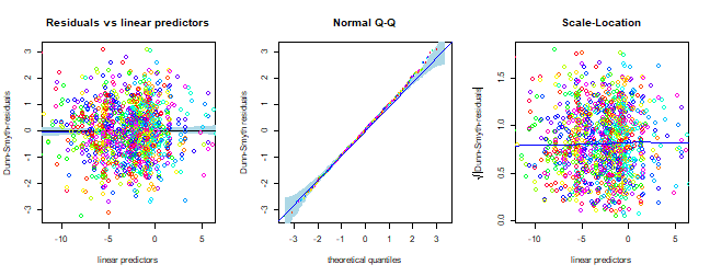
plot of chunk ex12.6assumptions
Code Box 12.8: Studying each observation separately for the Iris data
by(iris, iris$Species, function(dat){ apply(dat[,1:4],2,mean) } )
#> iris$Species: setosa
#> Sepal.Length  Sepal.Width Petal.Length  Petal.Width
#>        5.006        3.428        1.462        0.246
#> ----------------------------------------------------------------------
#> iris$Species: versicolor
#> Sepal.Length  Sepal.Width Petal.Length  Petal.Width
#>        5.936        2.770        4.260        1.326
#> ----------------------------------------------------------------------
#> iris$Species: virginica
#> Sepal.Length  Sepal.Width Petal.Length  Petal.Width
#>        6.588        2.974        5.552        2.026
par(mfrow=c(2,2),mar=c(3,3,1,1),mgp=c(1.75,0.75,0))
plot(Sepal.Length~Species,data=iris,xlab="")
plot(Sepal.Width~Species,data=iris,xlab="")
plot(Petal.Length~Species,data=iris,xlab="")
plot(Petal.Width~Species,data=iris,xlab="")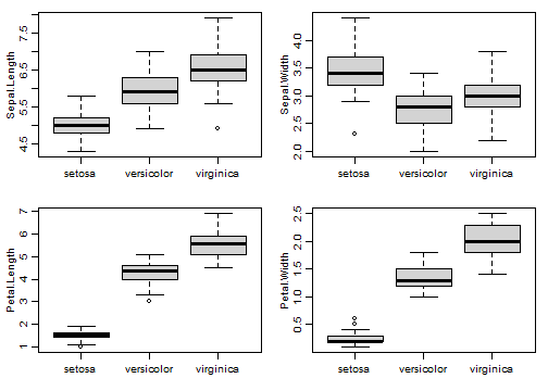
plot of chunk code12.8
#remove this chunk once gllvm has been updated on CRAN: